Dental+ Onboarding Re-vamp
Problem
Business Goal
Enhance member utilization of Philips Dental+ by focusing on improving drop-out rate, onboarding completion rate and the Dental+ app download rate.
Outcome
Onboarding flow had complex eligibility process and low user adoption, which significantly impacted engagement and the ability to demonstrate effectiveness to payers.
3 new insurance contracts with a 100% approval rate of eligibility file process. 20% increase in app onboarding completion rate and 95% Satisfaction rate in user testing yielding an anticipated increase in app download rate.
At a Glance
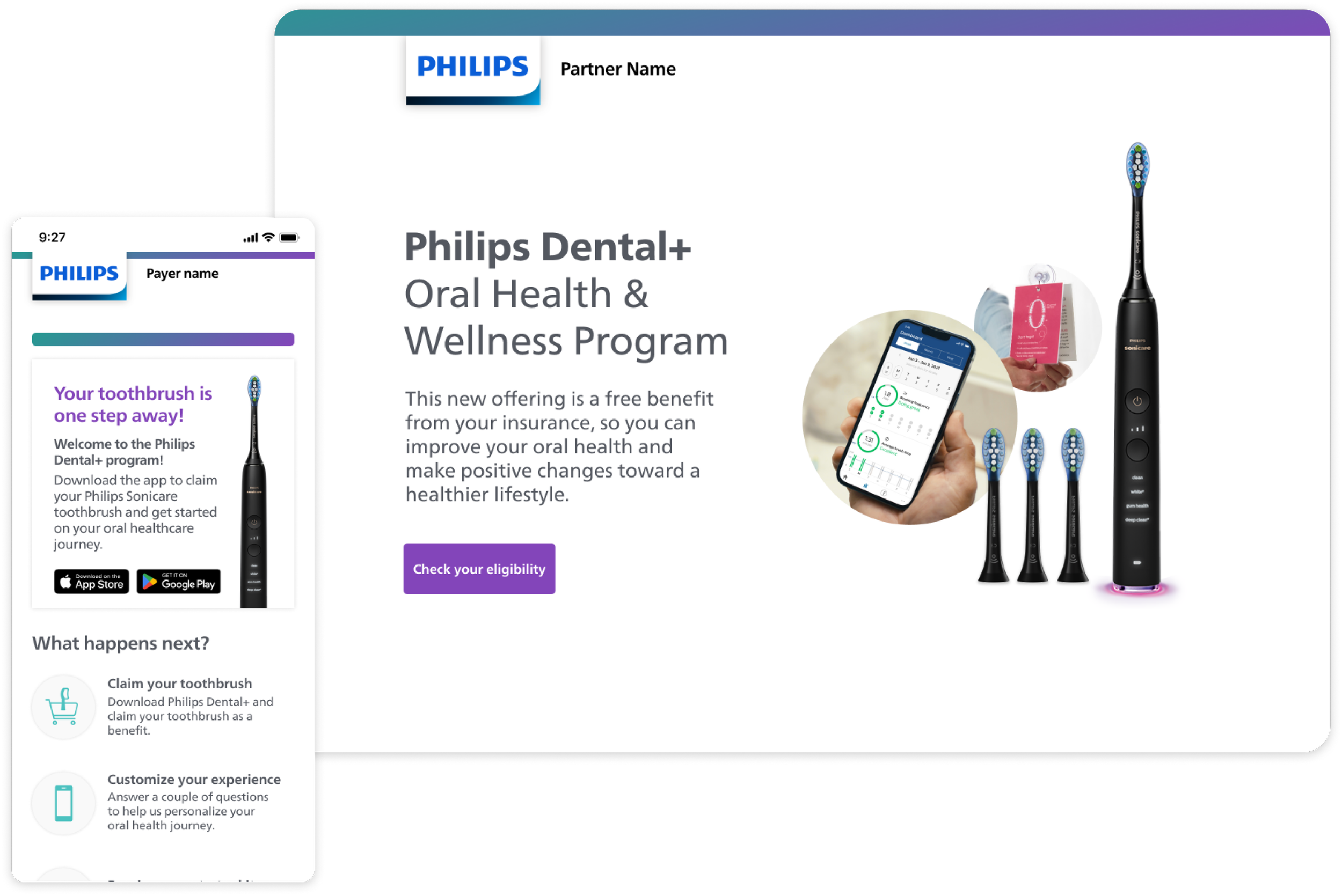
Dental+ is a program that Philips Oral Healthcare provides to insurance companies, employers, and governments as a benefit to their members.
My role
Lead UX designer, Lead to junior service designer.
Team
Me, a PM, UX researcher, Head of engineering, and Director of Design.
Methods
Product Strategy, Design workshops, Stakeholder management, user testing
Timeline
Mar - Oct 2023

Stakeholders Management
first challenge
Unifying Team Perspective on UX and Business goals
Due to multiple leadership and role changes, our Dental+ team wasn't aligned on the core experience problems and their connection to business metrics. To solve for that, I conducted a two-day workshop to build the E2E service blueprint so we could speak the same language.
How I solved it
Prioritised a list of ‘this could kill us’ problems
I distilled the service blueprint into a simple flow highlighting both user and Philips problems so we can prioritise P0 problems.
01
Second Challange
Rallying the team behind the solution
It was crucial for the Dental+ team to be as invested in the new solution as the design team, especially since this approach marked a significant pivot from an extensive previous revamp.
How I solved it
Leading an ideation workshop
I facilitated an ideation workshop that produced three unique onboarding flows created by our cross-functional partners. Despite not coming from a UX background, participants reported high satisfaction with the exercise and developed a strong sense of ownership toward the new solution

Third Challange
Execution accelerated too fast
After briefing our technical team on the new solution through user flows, we experienced an accelerated timeline. This left limited to no time for validating some of our hypotheses.
How I solved it
One-week sprint: from low-fi to decision-making
Within one week, I developed a rapid lo-fi prototype to detail the user experience. This expedited process enabled the PM and me to distinguish between the experience elements that could be implemented immediately and those requiring user testing before advancement
Diving into the solution
Problem 1: How might we Optimize eligibility verification for better user and payer experience?
We began by investigating standard eligibility verification practices in the payer industry. Following this, we designed and negotiated a new architecture with the development team, third-party processors, and marketing team, ultimately obtaining endorsement from our payer partners to proceed
(PREVIOUS) Step 1: Log in with your insurance account
02
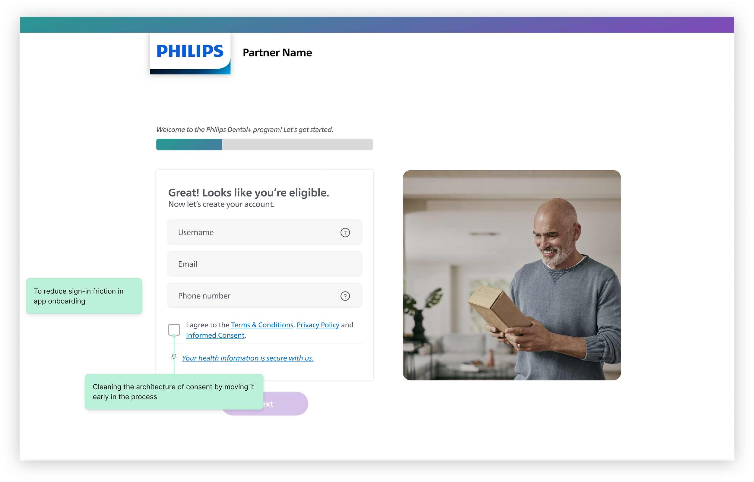
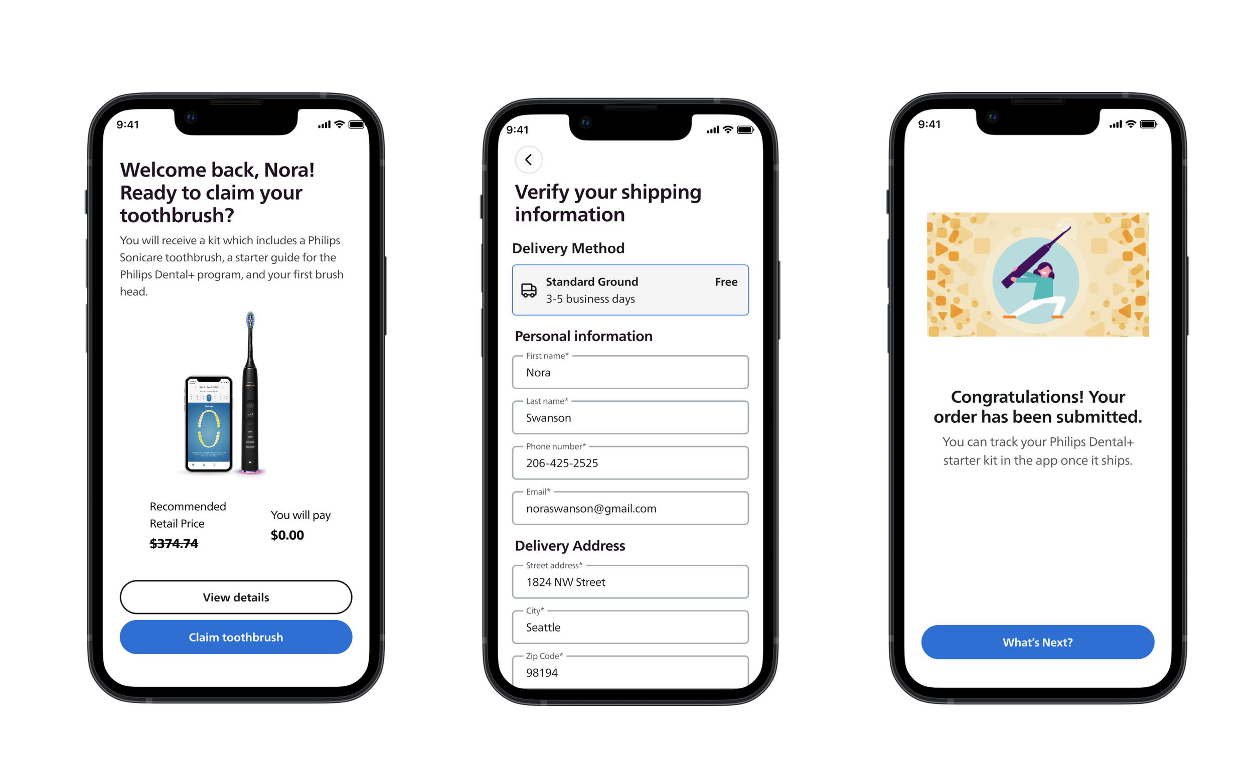
(New) Step 1: Enter your personal information
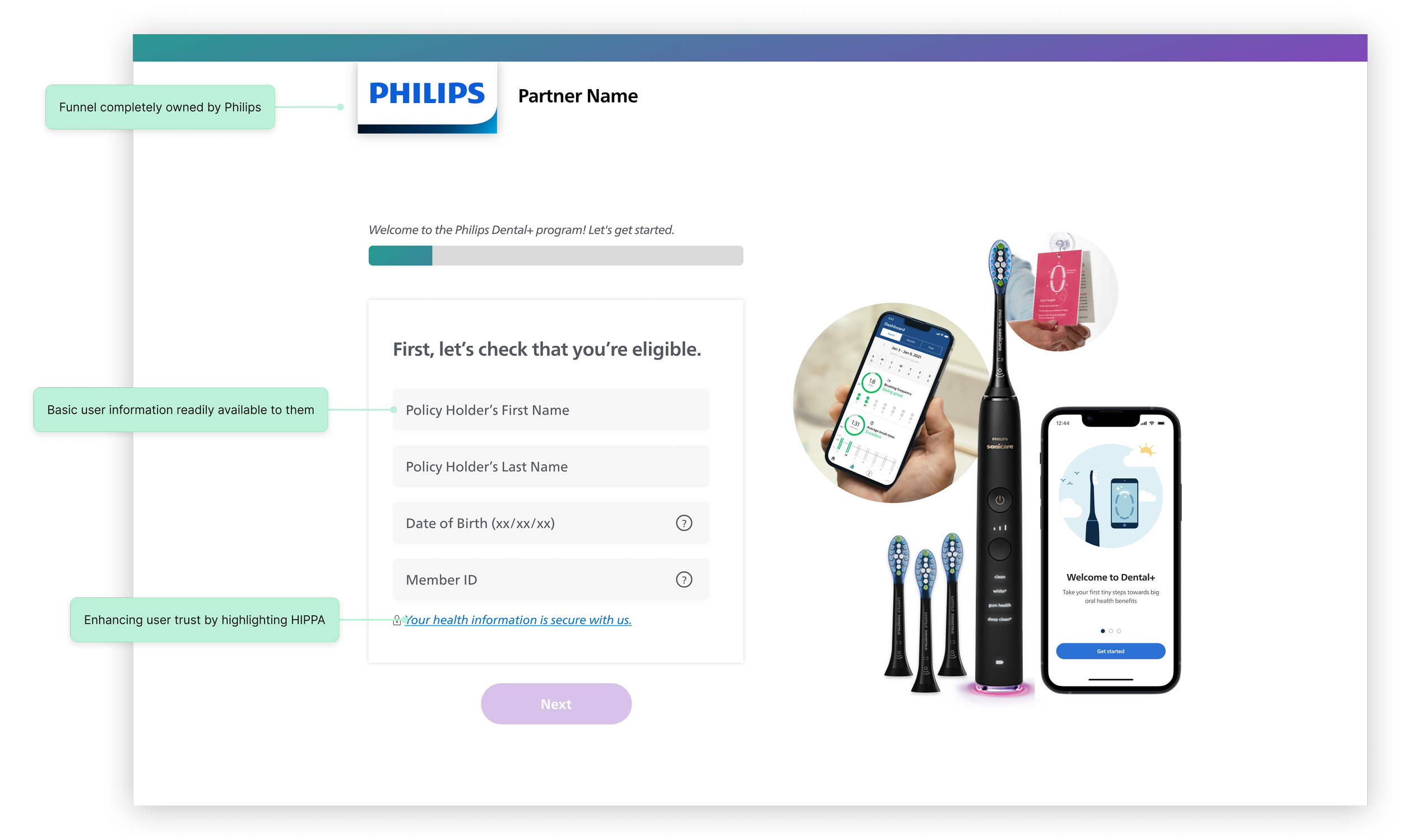
(New) Step 2: Create an account with Philips
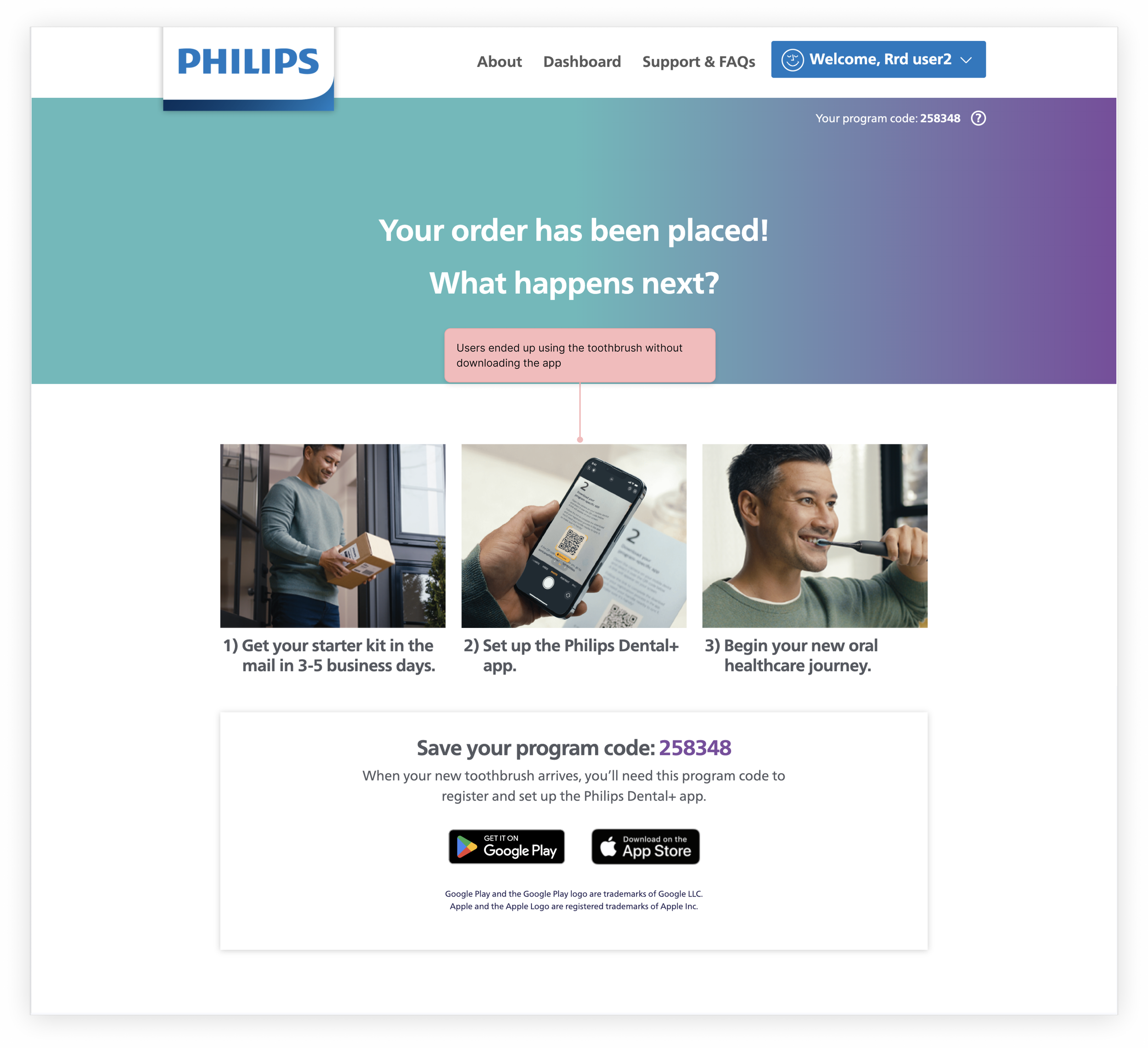
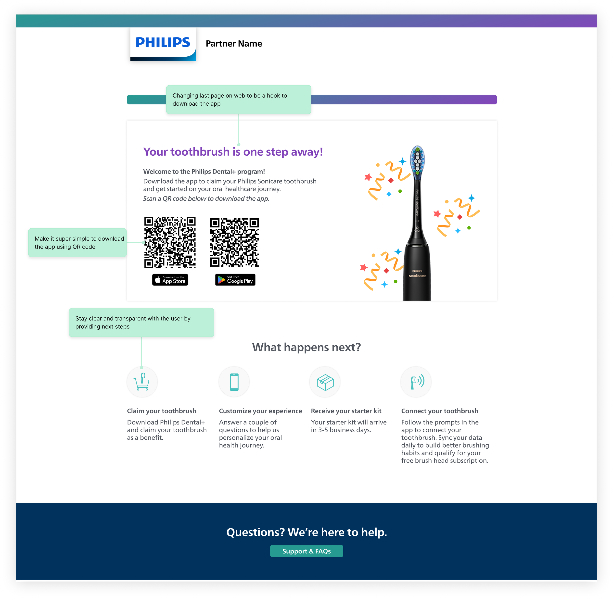
Problem 2: How might we increase Dental+ app download rate?
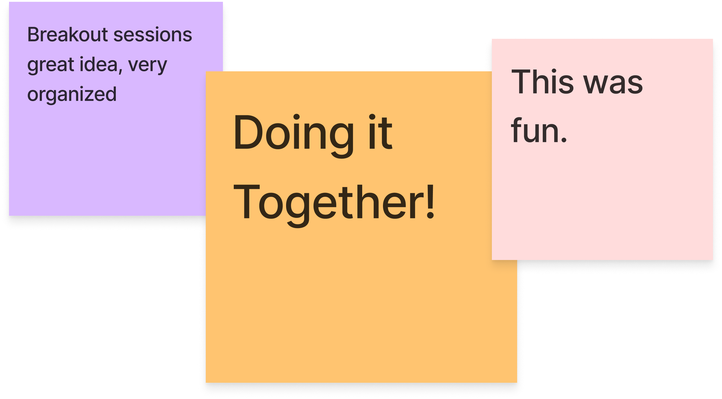
Recognizing the app's download rate as vital to the program's sustainability, we applied BJ Fogg's behavioral change model and service design principles. We developed and mapped out a simplified flow, which was then tested with 14 participants.
(PREVIOUS) Step 3: Order your toothbrush
(New) Step 3: Prompt to download app
(New) Step 5: Order the toothbrush on App

User testing
Are users willing to download the app to claim their free toothbrush?
Confirming this hypothesis was crucial and non-negotiable as it can completely kill our business. In one month, I built a prototype, co-designed the study with our UX researcher and was the note taker for our sessions to come to our conclusion.
85%
Of participants were willing to download the app to claim their free toothbrush
92%
Of participants mentioned it was easy to verify their eligibility using their Insurance ID
95%
Of participants mentioned that their enrollment experience felt smooth and easy
03
Method
Usability studies, Individual Interviews
Sample Size
14 Participants
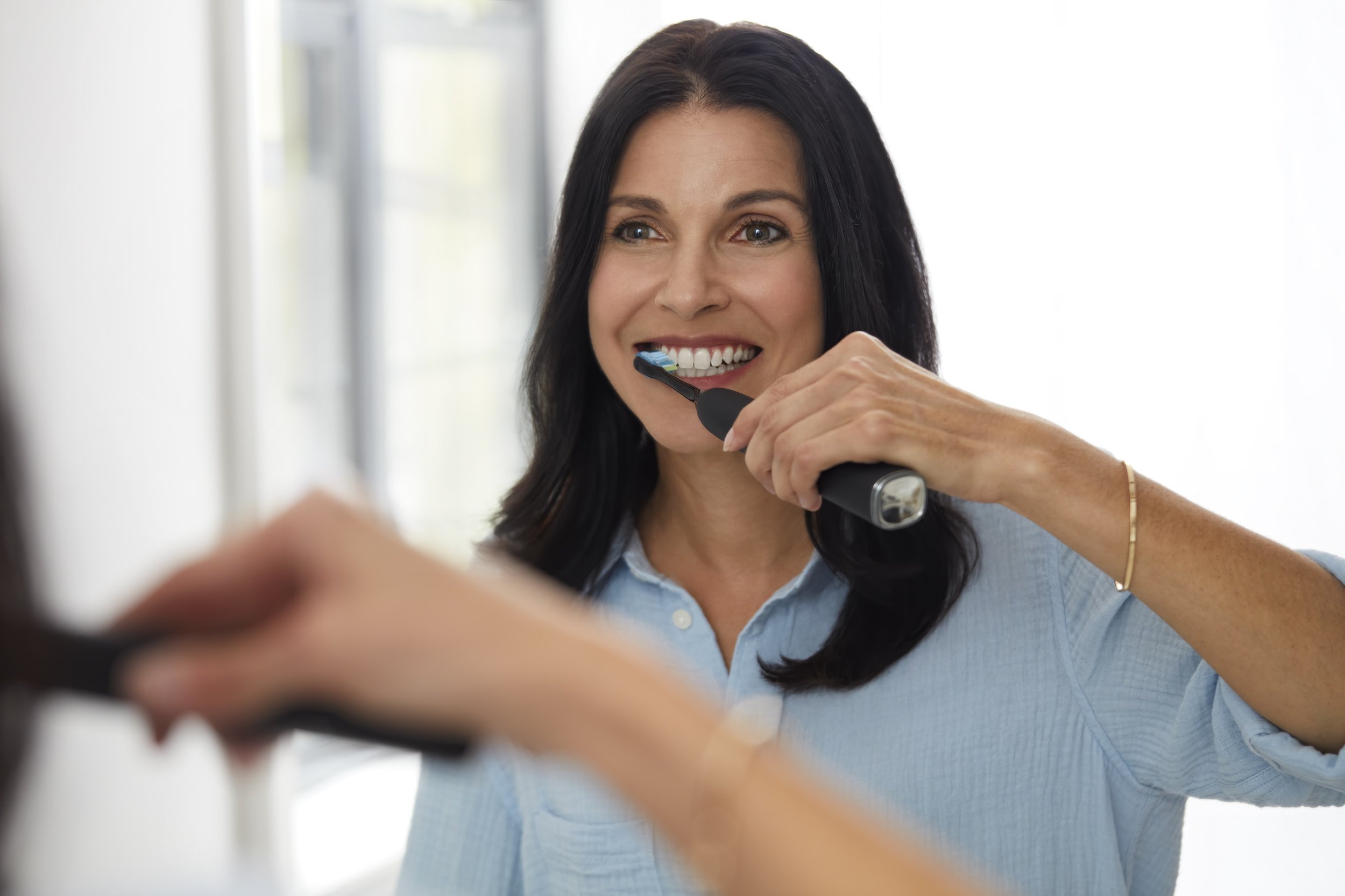
Problem 3: How might reduce friction in Dental+ app onboarding experience?
In addition to enhancing the web experience, I overhauled the app's onboarding process, from updating the design system and modifying the login and consent framework, to introducing a new questionnaire feature and prominently displaying toothbrush status within the app
Metrics Improved
53% to 74%
Onboarding completion rate
Key Learnings

Good UX = Good solution architecture
The foundation of great UX sometimes lies in questioning and refining backend systems. Our work on SSO and consent systems highlighted this principle.

Leadership Through Impact
Leadership in general transcends formal titles; it's about rallying cross-functional teams and driving impactful execution

03
The Imperative of Rigorous Research
When overhauling user experiences, uncompromising research is vital. I recognized the need to challenge our riskiest assumptions without letting tight deadlines compromise the quality of our investigations