Patient Portal
Redesigning Genome Medical’s mobile experience to improve brand identity.

At a Glance
The patient portal is a web experience that lets users access Genome Medical genetic counseling services. My goal was to create a mobile experience that is consistent with our desktop version.
My role
Lead product designer directly reporting to two senior designers.
Team
Me, 1 lead designer, 1 senior designer.
Methods
Product Strategy, Heuristic Evaluation, User Flows, IA, Interaction / Visual Design, and User Testing.
Timeline
Aug - Sep 2020
Context
Genome medical connects individuals and health care providers to genetic experts with a cloud-based telehealth platform in six areas of expertise. The patient can schedule a session with us using Genome Medical Patient Portal. This service provides the patient with a personalized clinical action plan that incorporates genetic test results into actionable steps for precision health care.

Problem
41% of Genome medical patients currently use our services through mobile. However, the Patient Portal is mobile functional but not optimized for usability which cannot support a growing mobile user base.
hypothesis
By creating a design system and guidelines tailored for mobile, we can improve the patient portal experience and bring a consistent user experience throughout multi-devices ranging from desktop to mobile.


My Process
I collaborated with the design team to have bi-weekly design meetings with rich discussion and feedback on the design concepts and the user experience. These meetings enabled me to reiterate my thinking and design process before we tested with real users at the end of the project.
Exploring Patient Portal
I started this project by getting familiar with the portal, I had meetings with the design and clinical teams to learn about the portal history and its design decisions. Then I explored the portal experience myself and conducted a detailed heuristic evaluation. This helped me map out the existing usability issues within the user flow.

Quantitative Data
In order to understand how functional the current scheduling experience is, I looked at Google Analytics to see if there were any drop-offs and where they occurred. As indicated below, mobile had a higher bounce rate than desktop from account registration throughout purchasing a session.

User Behavior Analytics
I utilized Hotjar recordings to check recorded sessions of mobile users. Recording heatmaps helped revealing how users interact with different elements and sections within the pages. It also revealed many pain-points and struggles that couldn’t have been captured with a heuristic evaluation.
Challenges Uncovered

Mobile Interactions
Not all desktop interactions translate well into mobile. Multiple users had frustrations using the scheduling calendar or had trouble understanding the next step after confirming the appointment. There were also multiple responsiveness issues that sometimes prevented users from moving forward.
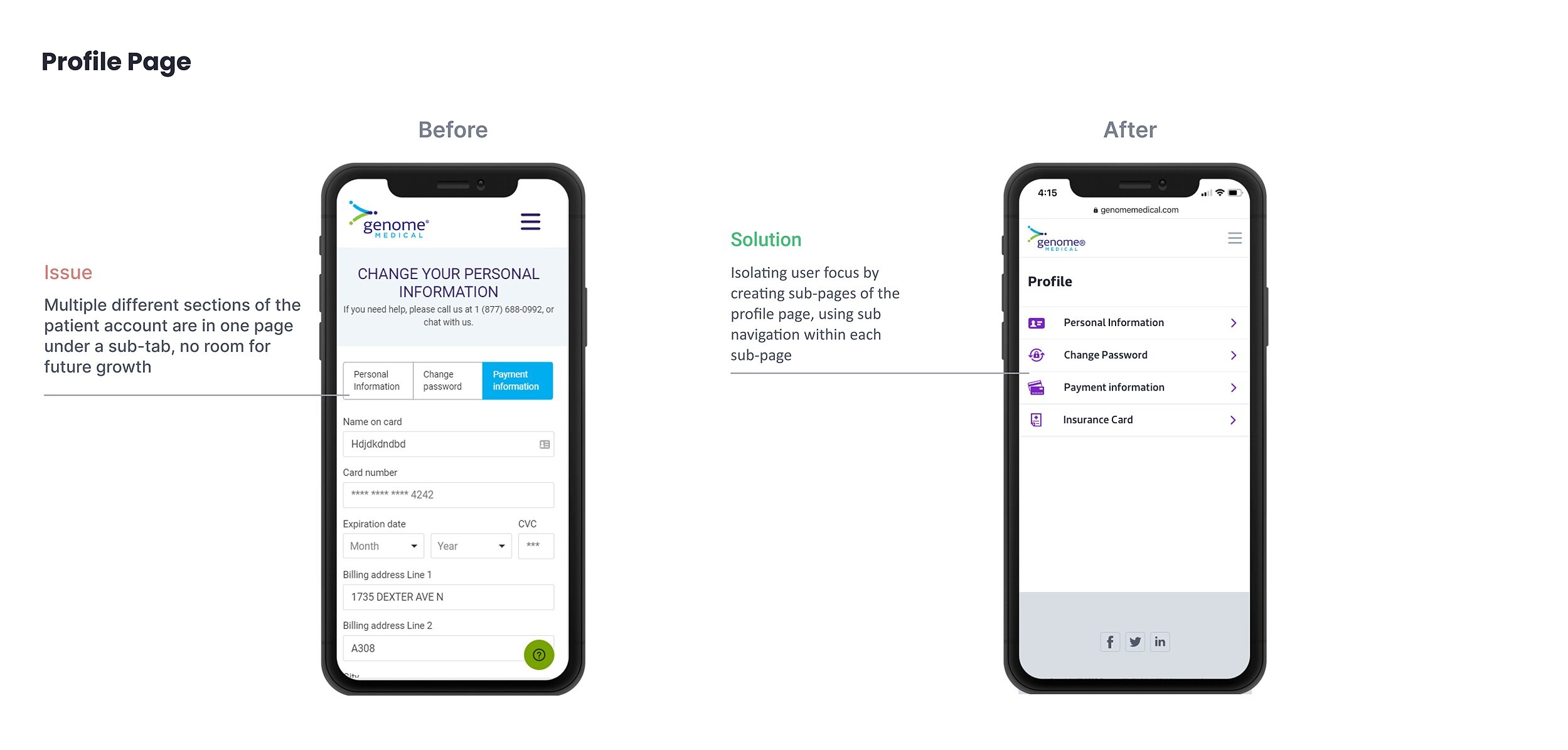
Consistency
This manifested due to the lack of a mobile design system often resulting in inconsistent CTA buttons, field states with different error states, and different spacing/margins between elements.
Design Principles
Here are the guiding principles I set for myself before jumping into ideation. Although tailored for this project, the guiding principles are derived from the design team guiding principles to keep a consistent experience throughout all of our products.

Iteration & Collaboration
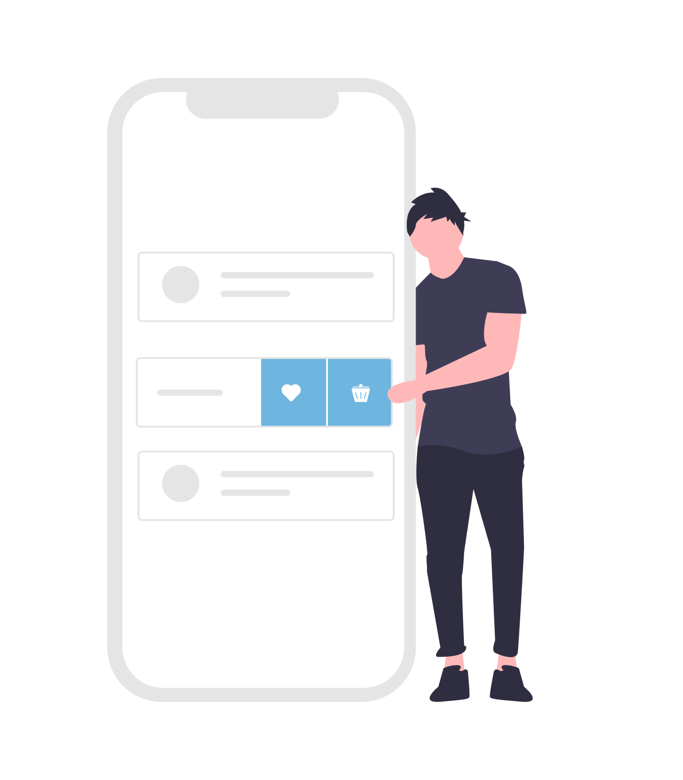
I started with low-fi prototypes tackling the UX of the scheduling flow. Once I had worked out the high-level overview, I would present my concepts to my team members in a series of weekly to bi-weekly meetings. With their critique, I would iterate over the initial concept and move forward to other features. Here is a quick glance into the iterations.
User testing
I wanted to make sure the full scheduling experience worked and made sense for the user. I conducted a full usability test with 3 internal participants who had no initial briefing on the project. I prototyped the wireframes in Adobe XD and moderated the sessions along with my colleague. The design yielded a 90% user satisfaction rate detailed list of the tasks shown below.
Unfortunately, due to the tight deadline, I wasn’t able to prototype and test the whole web app, which made it difficult to test some features properly. However, it gave us some useful insights into which features customers prioritize, and I was able to iterate the design to its final form based on these results.
Final Design
The final iteration of the patient portal solved the initial challenges and optimized the experience for better navigation, concise language, simple intuitive interactions, and improved legibility. This work was presented to the product and engineering team and will be implemented as a future roadmap project.
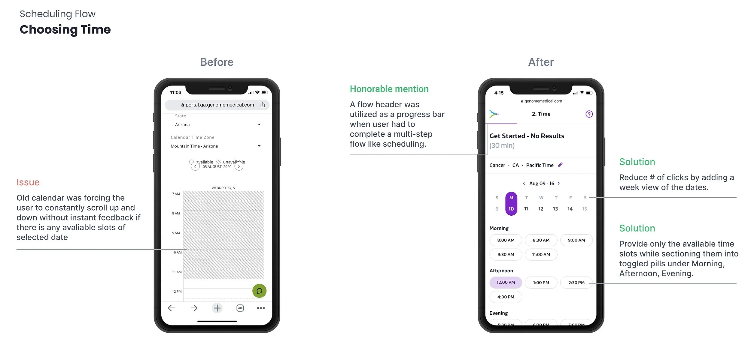
Selecting a time
Based on their preferred specialty and residing state. Patients can choose one of the available time slots to connect with their suitable genetic counselor.

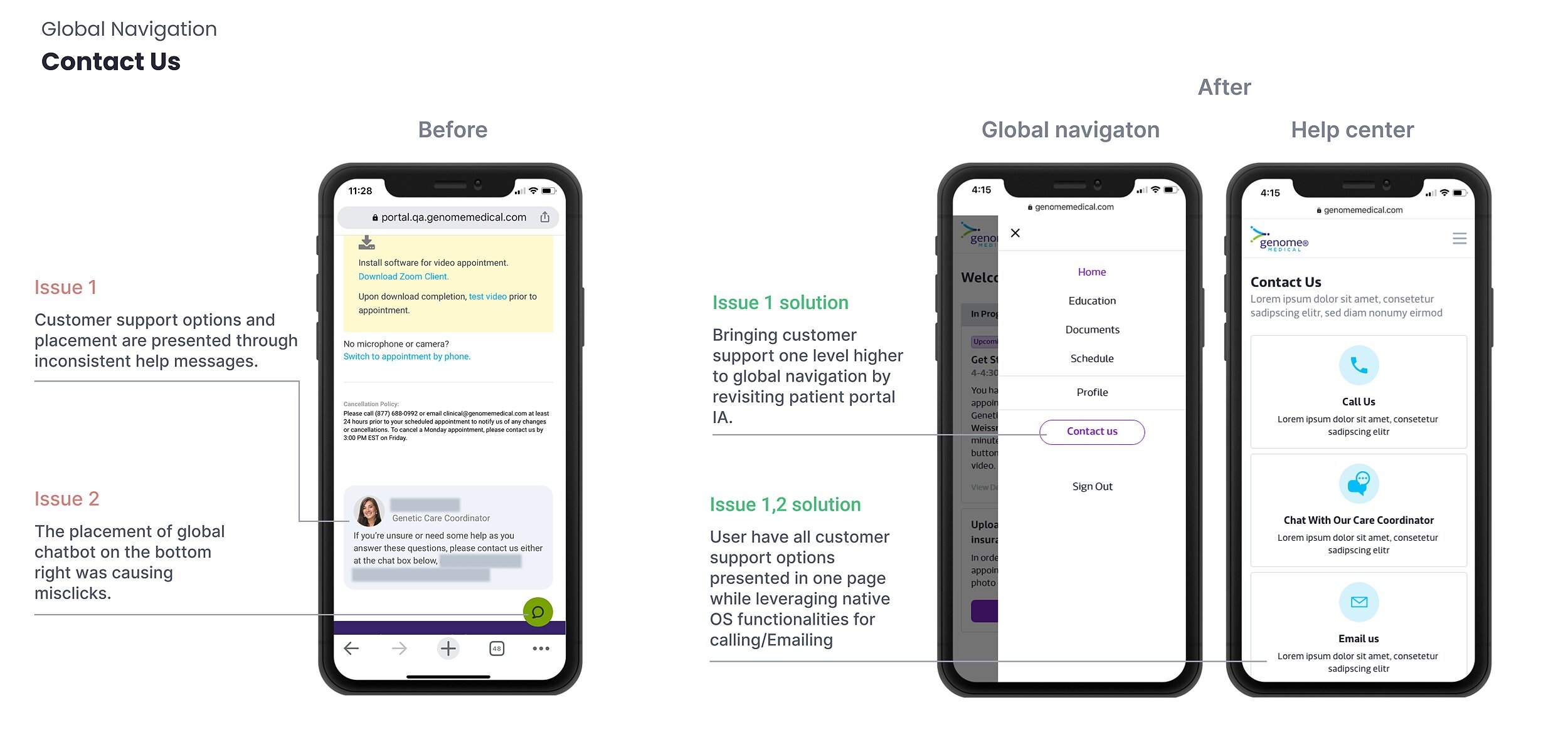
Asking for help
When all-in-one help center, patients can instantly reach out to our care coordinators through live chat, email or phone.

Educating Patients
Patient portal provides relevant content about genetics and other topics like carrier screening and reproductive health through the education tab.
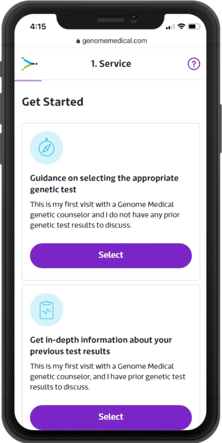
Choosing a service
The patient can choose from three different counseling options. Options provide a concise explanation to help the patient choose the most suitable service

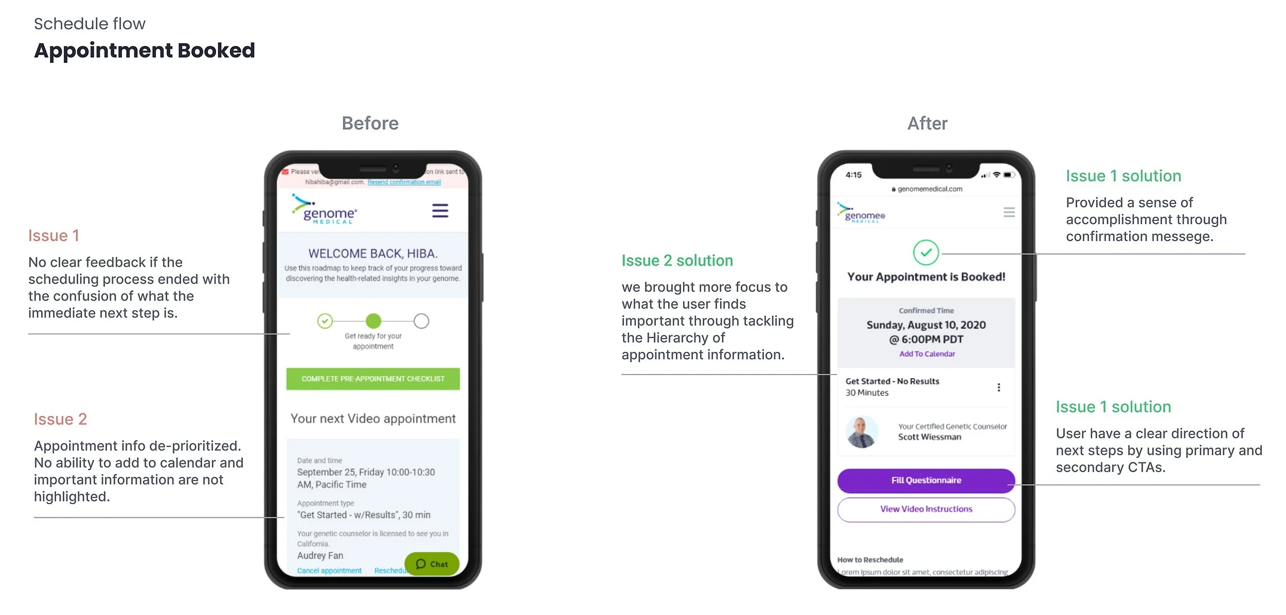
Appointment Confirmed
Once an appointment is confirmed, patients can add it to their calendar and proceed with completing the questionnaire and viewing the instructions.

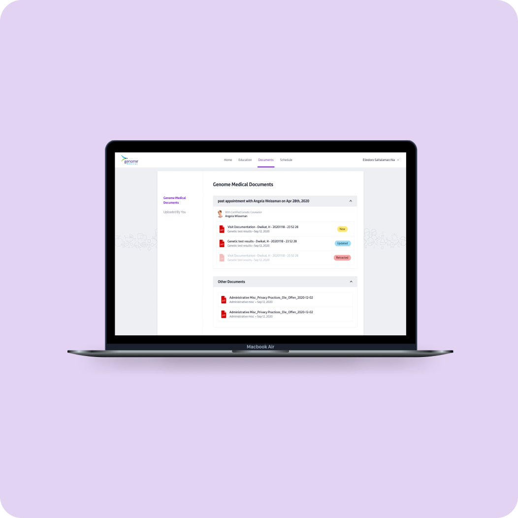
Viewing health documents
Patients can upload their health records to provide more context to their genetic counselors. They can also view their clinical action plan and test results through Post-visit summary.

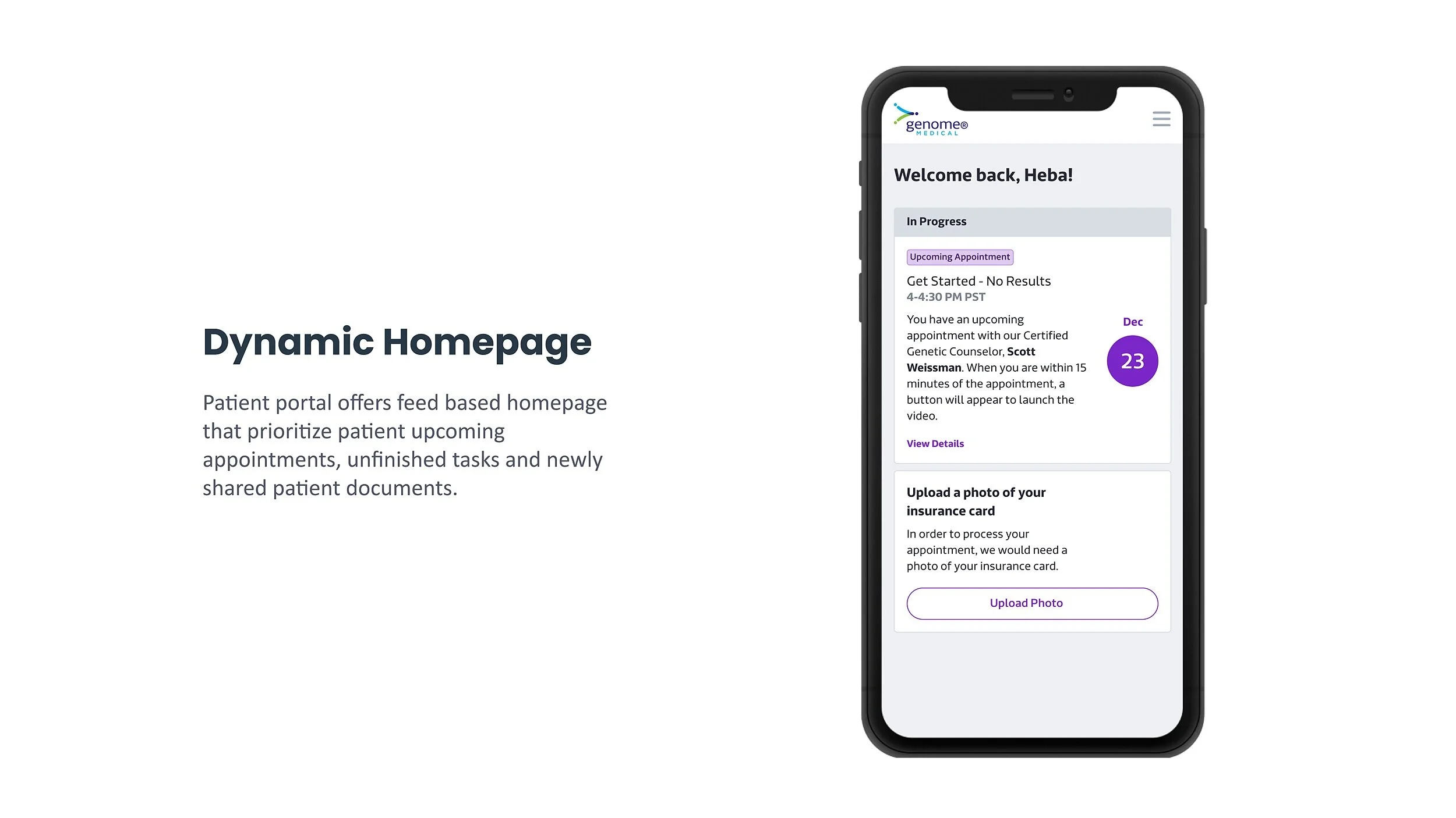
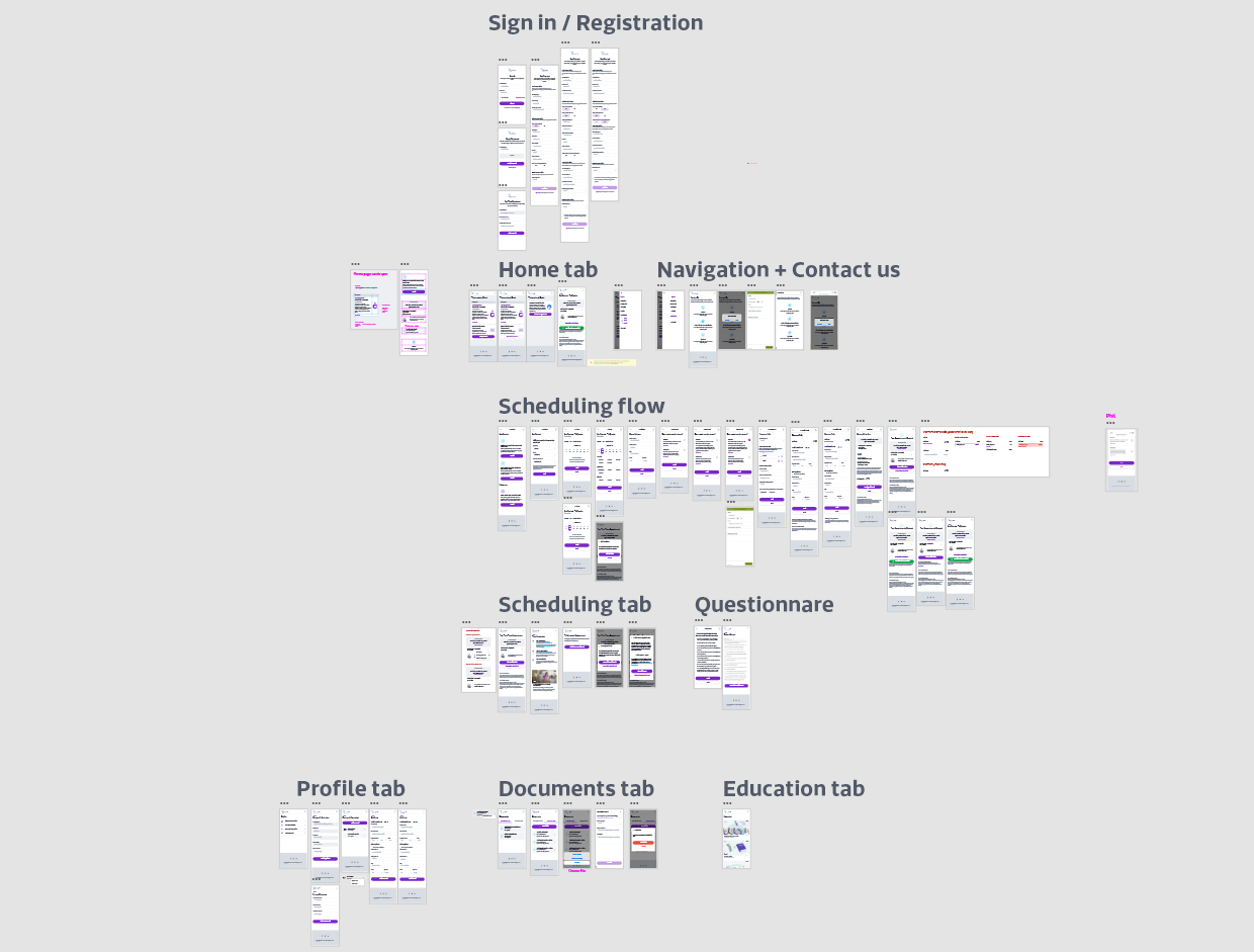
Here is a quick overview of the redesigned screens covering the full sitemap of the patient portal
Delivered Guidelines
We recycled the existing design system of our desktop solutions while modifying certain aspects for mobile like legibility, touch target, field inputs, navigation, and mobile interactions. This was a crucial step of the process as these guidelines can be carried on for future GM mobile products and keep a consistent brand identity. Here is a quick glimpse of the system:
Design System
Success Metrics
In order to measure the success of this redesigned user experience, I would focus on:
Average session duration
Mobile conversion rate
Net Promoter Score
Gather qualitative feedback from a sample of our users once the product launch
Re-check hotjar session with the heatmap feature
Takeaways
Insure to think outside the box with your solutions while considering the constraints and engineering limitations early on.
Include main stakeholders in the design discussions early on.
When in doubt of our design biases, ask the user for feedback